Analyzing My GitHub Activity
This post is a reflection and analysis of my activity on GitHub over the past 5 years.
Introduction
When I was a freshman in high school, I participated in a hackathon with a few of my friends. In preparation for the competition, I chose to teach myself how to use Git so that I could more easily collaborate with my teammates. Git is a service to handle version control, which you can think of as a more manual version of Google Docs or OneDrive. Since that day in 2015, I began to use GitHub more and more, and now use it multiple times per month, if not per week, for a variety of projects. I use GitHub for personal endeavors, projects I’m working on with other people, software made by other people I want to improve, and even private projects that are pre-release. Now, to understand this analysis project, it is crucial to learn some key terms used by Git:
- Commit: a group of changes all “backed up” at once, under a single message. Ideally, these changes are related.
- Pull Request: when you want to merge your changes into someone else’s code, or another version of your code, you create a pull request—which is you requesting to pull in your new changes. Requests sometimes need to be officially reviewed and approved by another user to be accepted.
- Repository: a single project is usually encompassed inside a single repository, which is like it’s own independent file system.
- User: each user of GitHub has a unique username.
- Issue: official documentation of a problem with the repository, can be commented, assigned, tagged, etc. to provide better management.
Knowing these basic definitions will help in understanding the data I am analyzing in this report. Additionally, it is important to understand what GitHub’s definition of a “contribution” is:
- Committing to a repository’s default branch or gh-pages branch
- Opening an issue
- Proposing a pull request
- Submitting a pull request review
(GitHub)
My GitHub use is a good way to analyze my programming activity because the more I’m programming in a given period, the more I will be using Git. For this project, I got access to my contribution data (sourced from my profile’s contribution graph, as well as all my commits since April 2020. I couldn’t figure out how to get commits further back in the past, but I think the data I was able to get is fairly representative of my normal use. This leads me to my next section,
Data Acquisition
At first, I planned to source data using this user insights API, but after a little, I realized that it only had data from repositories you owned and I did much of my work in repositories owned by other users. After further searching, I stumbled on this contribution chart generator which is a great little project for generating better contribution charts for sharing. It took a little modification, which I submitted a pull request to merge into the project for other people to use, but I added the ability to export the raw contribution data.
Next, I wanted a data source that had the exact time data for commits, so that I could do a time-of-day analysis, so I had to use the Github Events API to parse through my user’s events for pull requests, from which I was able to get commits authored by my user. From there I aggregated my selected data for analysis, which you can see in the next section:
Data Analysis
At the outset of this project, the aspect most interesting to me about this analysis was the time of day with the most activity. I expected that my activity would be greater late at night because I tend to be a night owl and also to commit all my changes before I log-off. To begin this analysis, I made a circular bar graph illustrating commits vs. time of day:
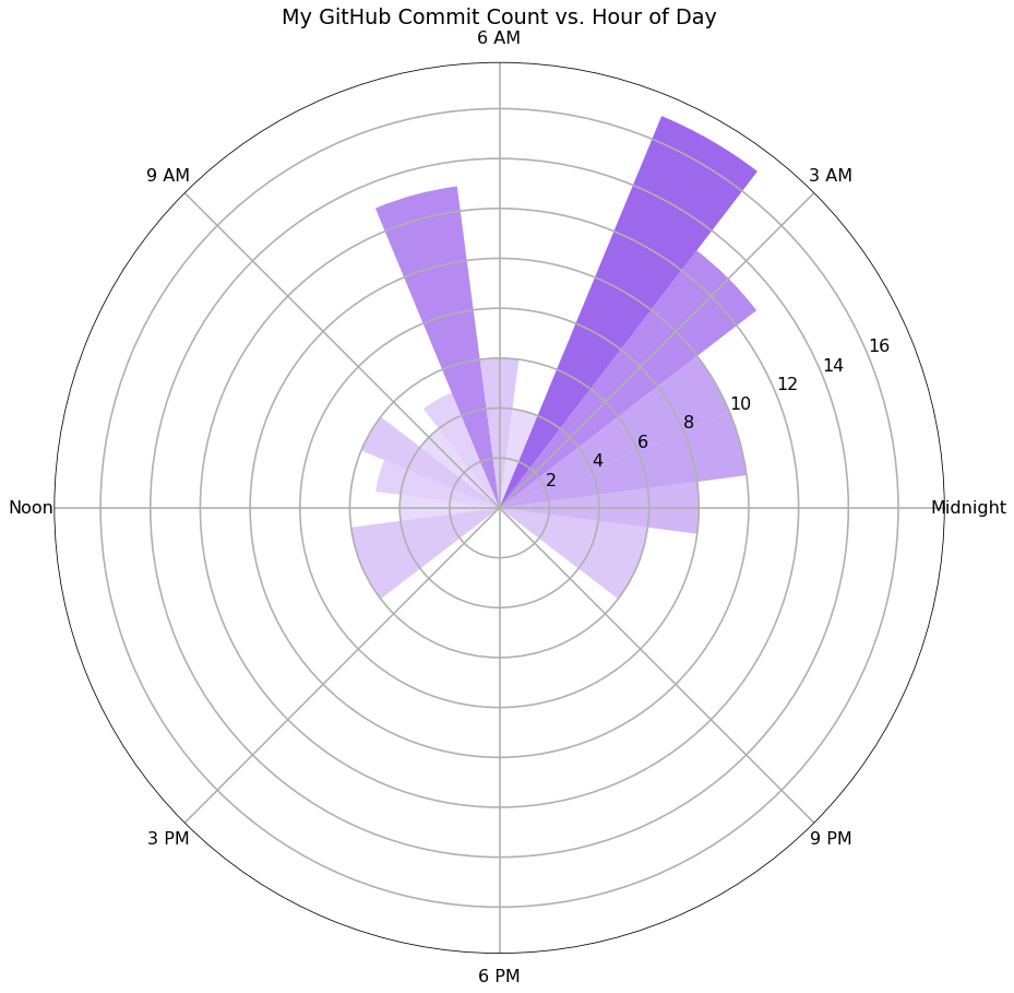
This graph showed me exactly what I expected about my usage: it was greatest between 3-6 AM, and non-existent from 3-9 PM. I used the service 17 times at 4 AM in the 3 months I gathered data from, and not at all during the hours 3-9 PM. This pattern illustrates an important detail about my usage: I tend to commit all my work before I go to bed, which tends to be late, after 3 AM. This data provides evidence of that behavior because I committed much more in the early morning hours.
Next, I wanted to analyze my contributions to see whether I added or deleted stuff more often. A core part of how Git works is storing changes as additions/deletions, which lets you save and compare changes. For this I compared the proportion of additions or deletions to the total changes in a given commit, and then looked at this across the 24 hours of a day. Here is that visualization:
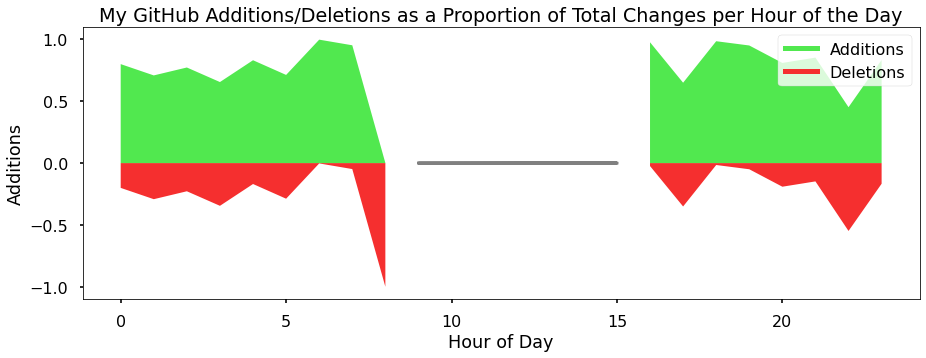
Unfortunately, I was disappointed in this one because there didn’t seem to be much of a trend with the time of day, but it did demonstrate that I tend to commit more additions than deletions. This makes sense because I am adding stuff in general, and I add more than I modify or delete (a modification counts as a deletion and addition).
Another interesting relationship I hoped to analyze was my usage throughout the year. I chose an approach similar to the hourly analysis, by graphing contributions by the day of the year. A contribution is defined in the introduction but is slightly different from a commit. Here is that graph:
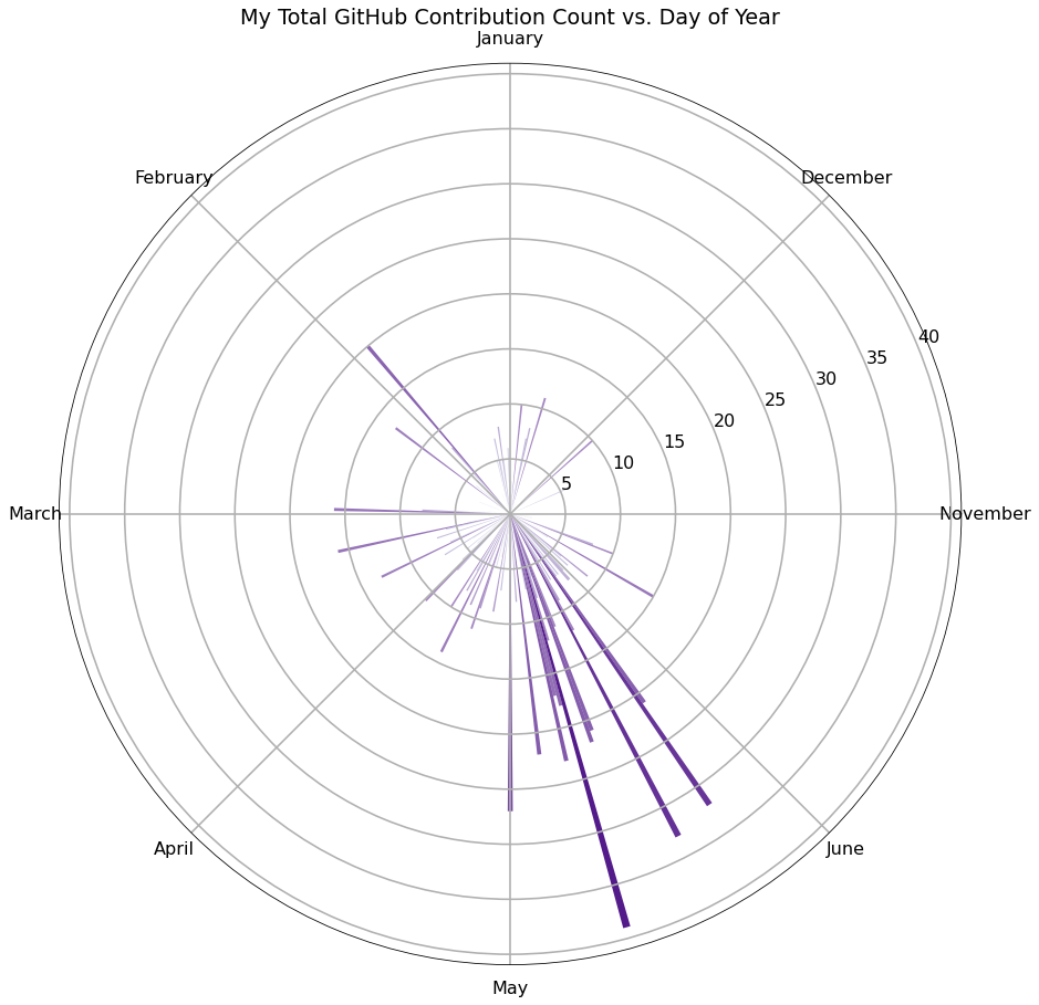
This figure illustrates how my usage during the summer is in general greater than during other parts of the year. This chart is over the last 5 years, which explains the trend: I use GitHub more now during the school year because my major is computer science and I have an internship, but during high school, I had much more free time during the summer and so I tended to make more contributions then. This pattern is also available in this graphic:
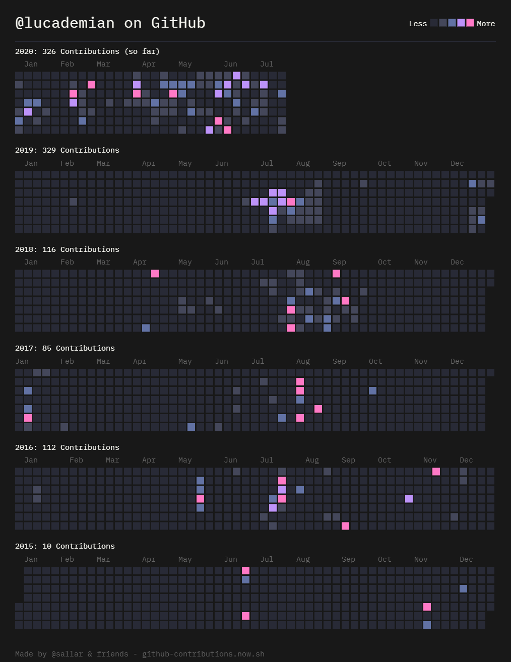
I obtained this graphic using GitHub Contributions Chart Generator, an online open-source tool, available for free.
Using the data from that same tool, I also made a stacked area chart to highlight the seasonal trend:
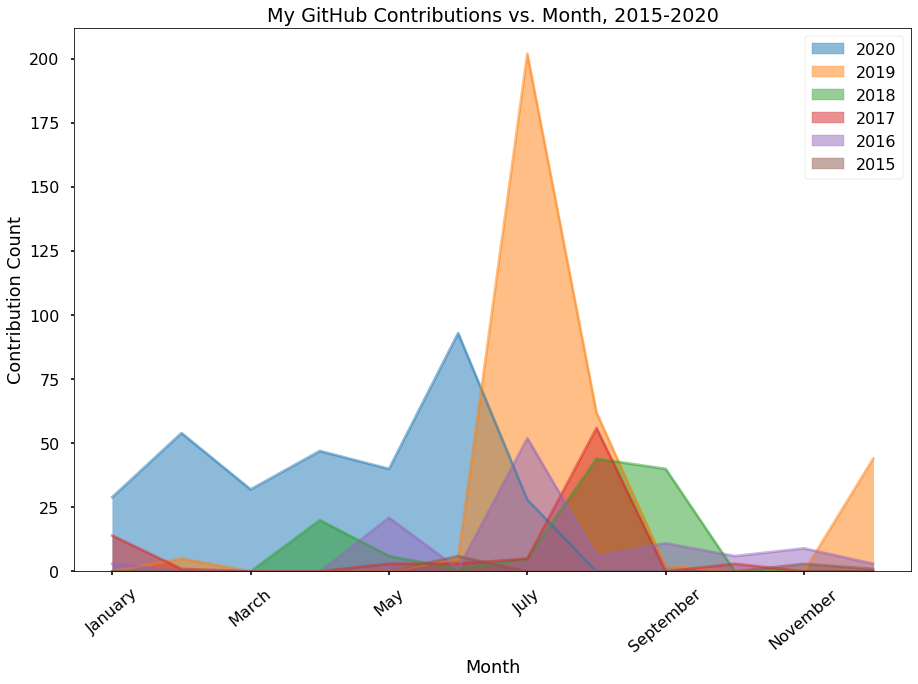
This clearly shows the seasonal relationship, because my usage spikes dramatically during the summer months.
Finally, after analyzing my usage over different periods, I wanted to look at my lifetime usage on the service. To do this, I first made a simple area chart showing how my usage has increased over time:
![Area chart showing my usage since 2015, with my yearly contributions on the y-axis and the year [2015-2020] on the x-axis](https://blog.lucademian.com/assets/img/contributions_vs_year.png)
Interestingly, this chart shows a dip in my usage during 2017, which is explained by me being busier in my junior year of high school compared to other years. Other than that, this chart doesn’t stand out too me. It shows that my usage is surely trending up and that I’ve already used GitHub more in 2020 than in any other year.
Finally, I made one more chart which isn’t exactly a great way to read the data but I thought it was still interesting:
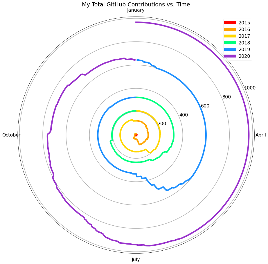
You can see how graphing total contributions on the y-axis, and month on the x-axis, with color distinguishing the year, results in a cool looking spiral graphic that illustrates my time on the platform well.
Discussion
Okay, so from the above data analysis, there were two clear trends: firstly, I tend to use GitHub more in the early morning hours, 3-6 AM. Secondly, I tend to use it during the summer months, with higher usage typically in May-August. These trends can be explained by my night-owl-tendencies and my status as a student, which explains more usage during summers.
Unfortunately, in my opinion, this doesn’t demonstrate algorithms shaping my activity. Although it could be argued that the act of programming is an “algorithm” in the loosest sense of the word, I think of it as more of a writing activity. Annette Vee agrees with this interpretation, writing in her book Coding Literacy that “programming, like writing, is a symbolic system operating through an inscribed language. As such, programming follows a particular grammar, encodes and conveys information, and is socially shaped and circulated” (Vee 98). With this interpretation, the algorithm then becomes GitHub and other tools I use in my “writing”.
For an algorithm to shape this activity I would need to show that my activity changed because of an algorithm, and this analysis was more illustrative of an algorithm matching my activity. Looking at GitHub activity showed me that my programming is closely linked to my usage of GitHub, but GitHub itself isn’t changing my behavior. I don’t think my coding behavior is much impacted by algorithms, at least consciously. The biggest impact is probably from my editor, which as a computer program could be classified as an algorithm.
This algorithm can change my behavior, because if it does its job well my productivity will increase, but if it glitches or does a poor job my productivity will be lowered for the day. Generally, my editor works well and makes me more productive than I would be otherwise with another editor. This is an example of how my writing activity is shaped by an algorithm — but GitHub still isn’t making any changes to it.
For a moment, I would like to acknowledge the flaws of using GitHub activity as an illustration of my programming activity. First of all, I don’t use Git for all my projects, so there is a bias here towards activity on team-based projects or projects I am sharing. Also, I don’t have great discipline so I regularly commit more changes than I should at once, on my projects. These flaws expose the error in treating limited dimensional data as a holistic picture of reality. This reminds me of John Cheney-Lippold’s We Are Data, which discusses the new concept of an algorithmic identity, summing ourselves up by a series of metrics to quantify and predict about us. Companies like Google are guilty of this, and it is what I have done in this analysis — I broke my programming activity down to a series of numbers when in reality it is far more nuanced.
This project overall showed me how important it is to reflect on your activity online, and how data can be informative and also misleading. While I didn’t find an algorithm shaping my activity, I did discover interesting insights into my activity. In the future, I want to conduct a similar analysis of other services, but especially ones I use all the time, like Instagram or Snapchat. I predict these services will be much more influential on my behavior compared to GitHub.
Works Cited
- Cheney-Lippold, John. We Are Data: Algorithms and the Making of Our Digital Selves. New York University Press, 2019.
- Vee, Annette. Coding Literacy: How Computer Programming Is Changing Writing. The MIT Press., 2017.